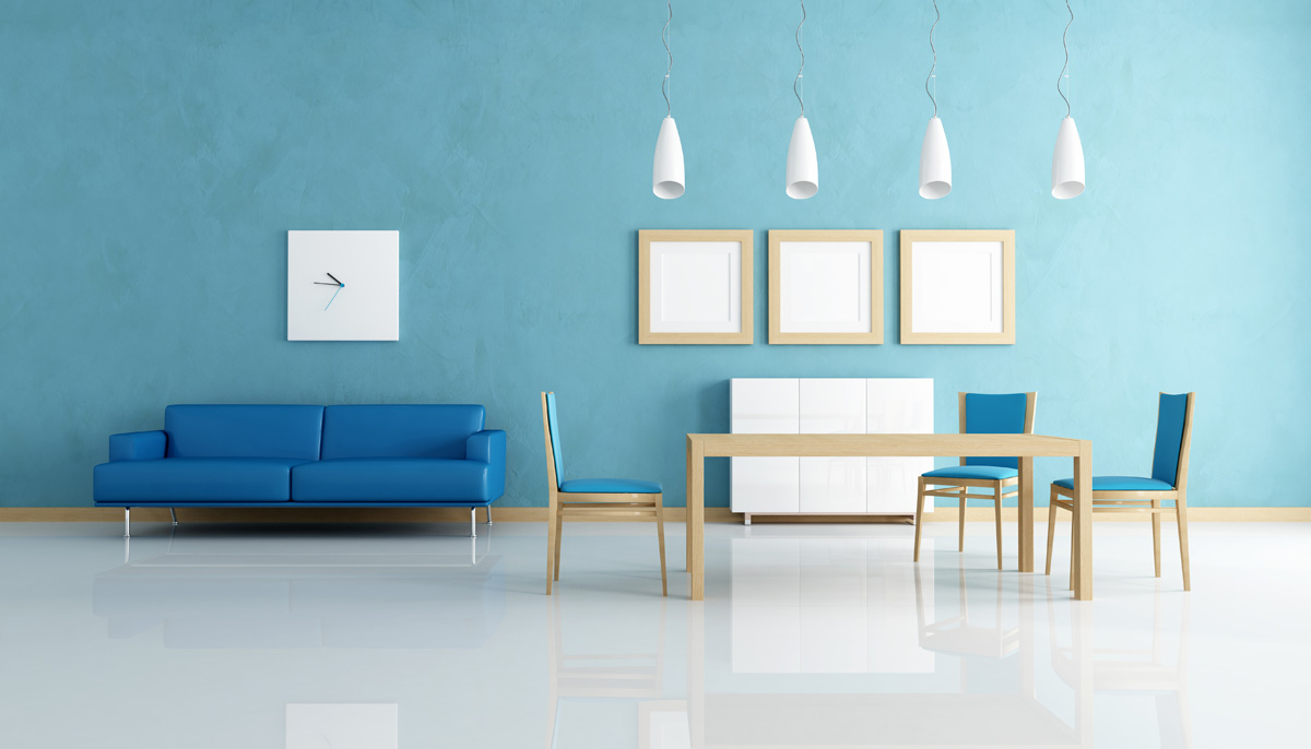
Lorem ipsum amet dolordipiscing elit. Praesent actum vestibu. Aenenonum hendrer mauris. Phasellus porta act. Fusctvarus sed met aenenonummy.
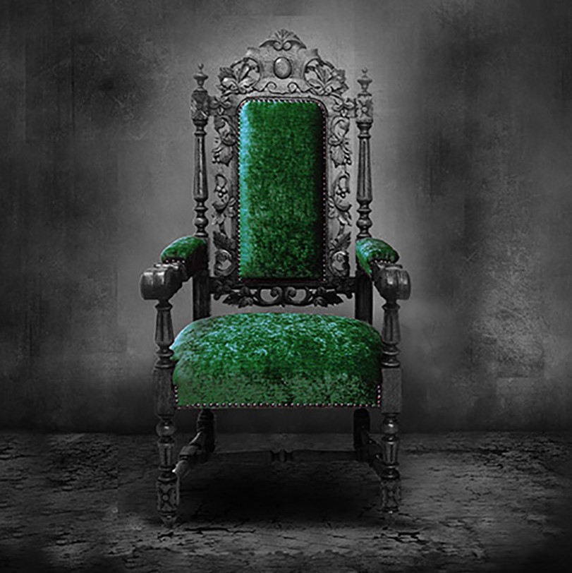
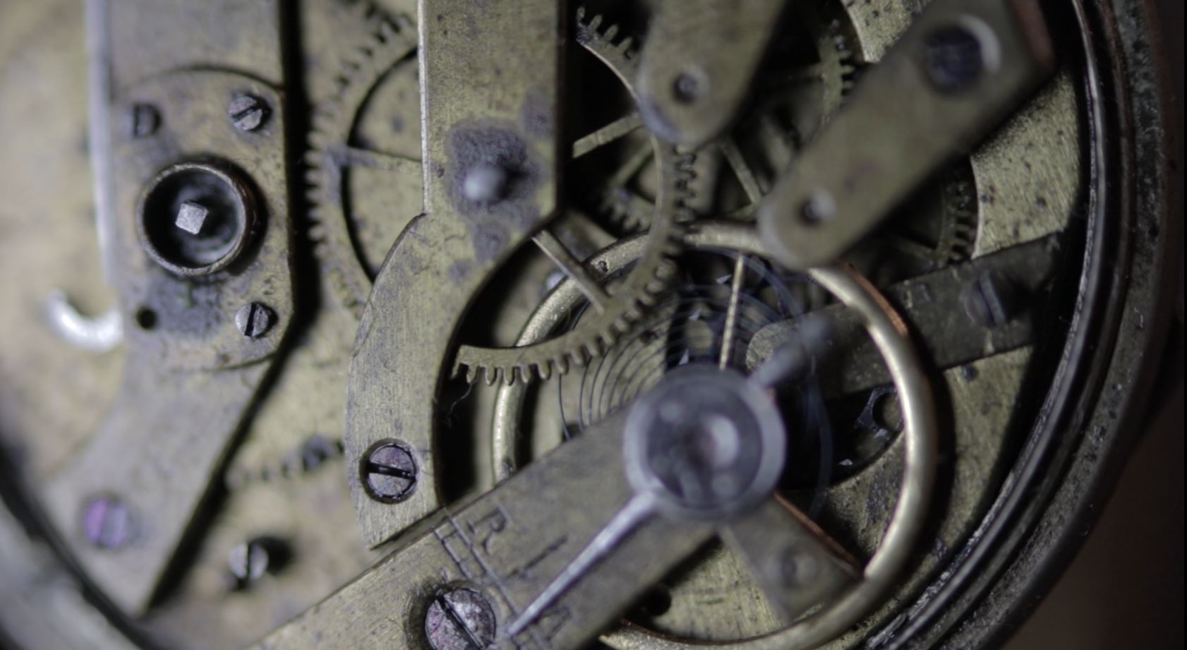
BAROKK STÍLUS
.Barokk – eredetileg olasz szó, a XIX. sz. közepe óta a reneszánsz stílust követő művészeti irányzat neve. A reneszánszra jellemző fegyelmezett mértani rendet a szabálytalanság váltja fel.
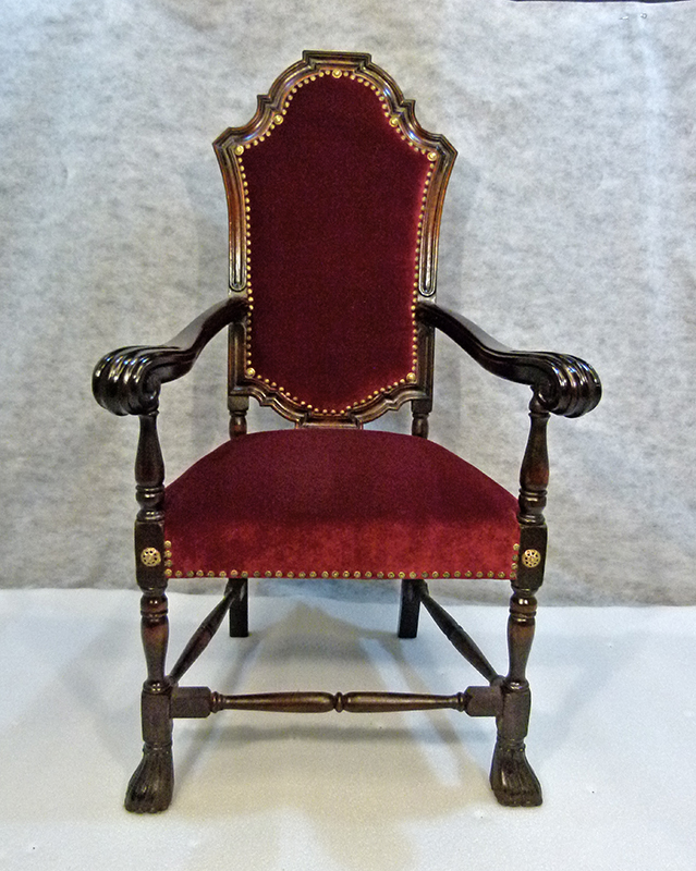
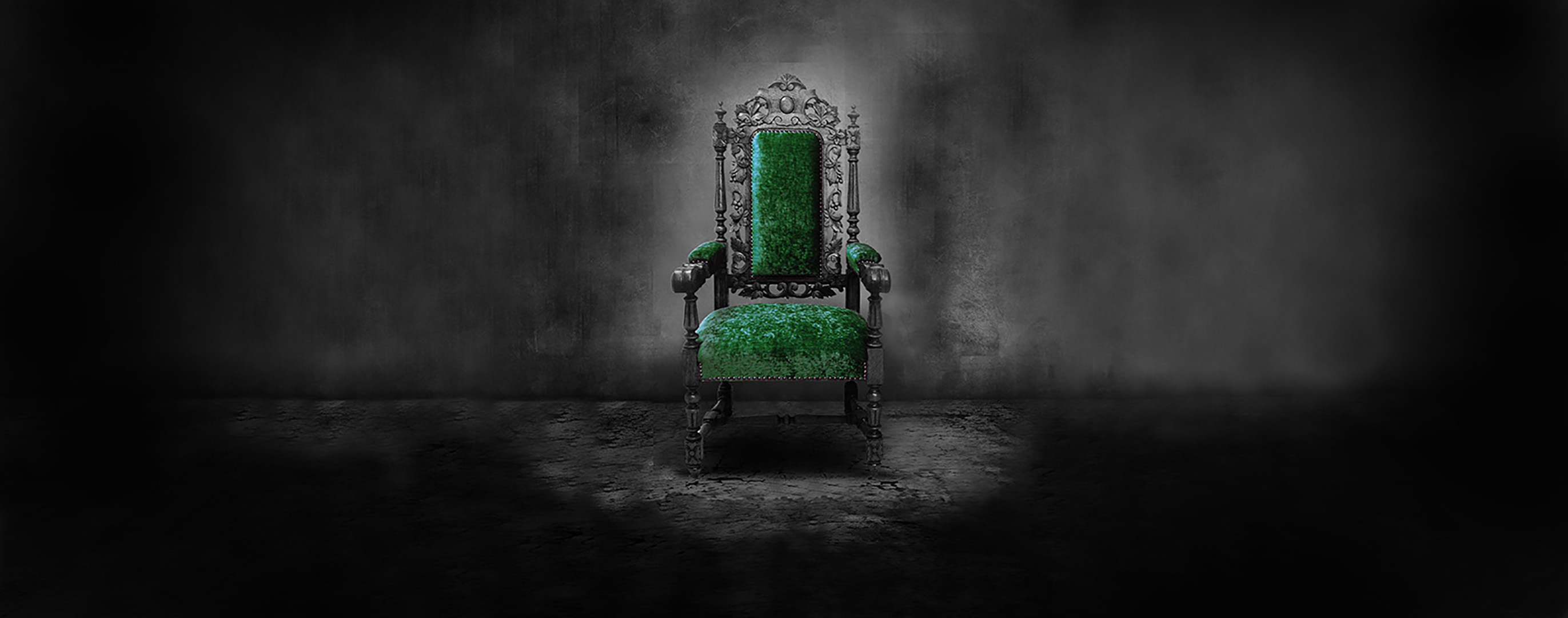
RENESZÁNSZ KAROSSZÉK
Lorem ipsum amet dolordipiscing elit. Praesent actum vestibu. Aenenonum hendrer mauris. Phasellus porta act. Fusctvarus sed met aenenonummy.
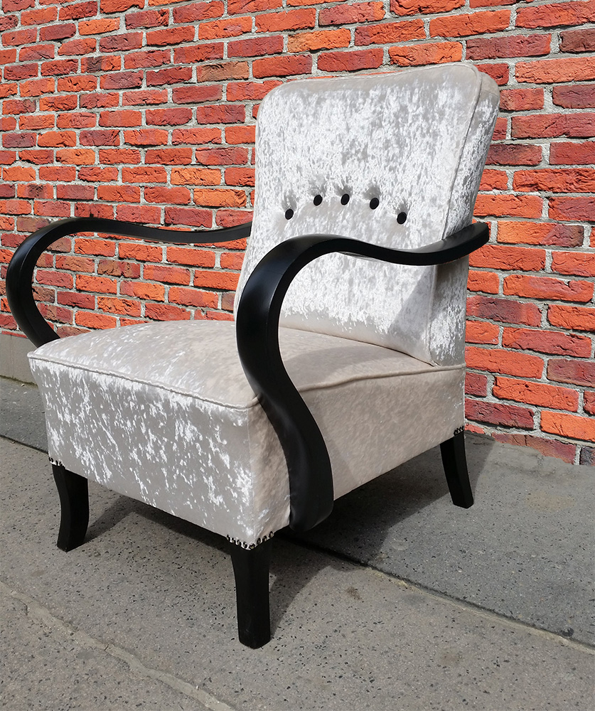
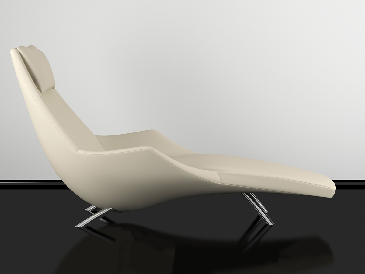
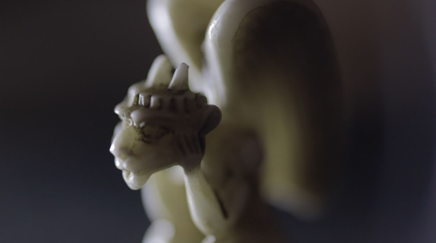
ART DECO FOTEL
Lorem ipsum amet dolordipiscing elit. Praesent actum vestibu. Aenenonum hendrer mauris. Phasellus porta act. Fusctvarus sed met aenenonummy.